1) What is the significance of Exploratory Data Analysis (EDA)?
- Exploratory data analysis (EDA) helps to understand the data better.
- It helps you gain confidence in your data to the point where you’re ready to use a machine-learning algorithm.
- It allows you to refine your selection of feature variables that will be used later for model building.
- You can discover hidden trends and insights from the data.
Exploratory Data Analysis (EDA) is a crucial phase in data analysis that involves examining datasets to summarize their main characteristics, often with visual methods. Here are the typical steps involved in EDA:
1. **Data Collection**:
- **Gathering Data**: Collect data from various sources such as databases, spreadsheets, or APIs.
- **Data Integration**: Combine data from multiple sources if necessary.
2. **Data Cleaning**:
- **Handling Missing Values**: Identify and address missing data through imputation, deletion, or other methods.
- **Removing Duplicates**: Identify and remove duplicate records to ensure data accuracy.
- **Correcting Errors**: Fix inconsistencies, typos, and incorrect values in the dataset.
- **Standardizing Formats**: Ensure consistent data formats (e.g., date formats, categorical values).
3. **Data Transformation**:
- **Normalization/Scaling**: Adjust numerical values to a common scale if needed (e.g., min-max scaling).
- **Encoding Categorical Variables**: Convert categorical variables into numerical values using techniques like one-hot encoding.
- **Feature Engineering**: Create new features or modify existing ones to improve analysis.
4. **Data Profiling**:
- **Summary Statistics**: Calculate measures such as mean, median, standard deviation, and quartiles for numerical variables.
- **Frequency Distribution**: Analyze the frequency of categorical variables.
- **Correlation Analysis**: Compute correlations between numerical features to understand relationships.
5. **Data Visualization**:
- **Univariate Analysis**: Use histograms, box plots, and density plots to understand the distribution of individual variables.
- **Bivariate/Multivariate Analysis**: Use scatter plots, pair plots, and heatmaps to explore relationships between two or more variables.
- **Time Series Analysis**: For temporal data, use line plots and seasonal decomposition to analyze trends over time.
6. **Pattern Detection**:
- **Outlier Detection**: Identify and analyze outliers using methods like Z-scores, IQR, or visualization techniques.
- **Trend Analysis**: Detect and interpret trends, cycles, or seasonal patterns in the data.
7. **Hypothesis Generation**:
- **Form Hypotheses**: Based on visualizations and statistical findings, generate hypotheses about the data and its relationships.
8. **Feature Selection**:
- **Identify Key Features**: Determine which features are most relevant to your analysis or model, using feature importance scores or correlation analysis methods.
9. **Data Reporting**:
- **Document Findings**: Summarize insights, patterns, and anomalies discovered during EDA.
- **Prepare Visual Reports**: Create charts, graphs, and tables to communicate findings effectively.
10. **Iterative Refinement**:
- **Refine Analysis**: Based on initial findings, iteratively refine the EDA process by focusing on new aspects of the data or re-evaluating previous steps.
EDA is an iterative process where each step may lead to new questions and insights, guiding the next phase of analysis or modelling.
14. How can you handle missing values in a dataset?
This is one of the most frequently asked data analyst interview questions, and the interviewer expects you to give a detailed answer here, and not just the name of the methods. There are four methods to handle missing values in a dataset.
Listwise Deletion
In the listwise deletion method, an entire record is excluded from analysis if any single value is missing.
Average Imputation
Take the average value of the other participants' responses and fill in the missing value.
Regression Substitution
You can use multiple-regression analyses to estimate a missing value.
Multiple Imputations
It creates plausible values based on the correlations for the missing data and then averages the simulated datasets by incorporating random errors in your predictions.
3)How do you treat outliers in a dataset?
(What are outliers in the data and how do you handle them?)
An outlier is a data point that is distant from other similar points. They may be due to variability in the measurement or may indicate experimental errors.
The graph depicted below shows there are three outliers in the dataset.
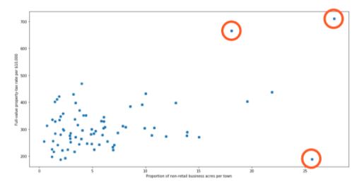
To deal with outliers, you can use the following four methods:
- Drop the outlier records
- Cap your outliers data
- Assign a new value
- Try a new transformation
Mode, median, and mean are three fundamental measures of central tendency in statistics. Each provides different insights into the distribution of a dataset. Here's a breakdown of their differences:
1. Mean:
- Definition: The mean, often referred to as the average, is the sum of all the values in a dataset divided by the number of values.
- Formula:
Mean=n∑i=1nxi
where xi represents each value in the dataset and n is the total number of values.
- Characteristics:
- Sensitive to Outliers: Extreme values (outliers) can significantly affect the mean.
- Uses: Commonly used in various statistical analyses and is useful for normally distributed data.
- Example: For the dataset [2, 3, 5, 7, 11], the mean is 52+3+5+7+11=5.6.
2. Median:
- Definition: The median is the middle value in a dataset when it is sorted in ascending or descending order. If the dataset has an even number of values, the median is the average of the two middle values.
- Calculation:
- Odd Number of Values: The median is the value at the center of the dataset.
- Even Number of Values: The median is the average of the two central values.
- Characteristics:
- Resistant to Outliers: The median is not affected by extreme values, making it a robust measure of central tendency.
- Uses: Useful for skewed distributions and in cases where outliers might distort the mean.
- Example: For the dataset [2, 3, 5, 7, 11], which is already sorted, the median is 5. For [2, 3, 5, 7], the median would be 23+5=4.
3. Mode:
- Definition: The mode is the value that appears most frequently in a dataset. There can be more than one mode if multiple values occur with the highest frequency, or no mode if all values occur with the same frequency.
- Characteristics:
- Non-numeric: The mode can be used with categorical data as well as numerical data.
- Uses: Identifies the most common value in the dataset and can be used to determine the most frequent category or observation.
- Example: For the dataset [2, 3, 3, 5, 7], the mode is 3 because it appears most frequently. For [2, 3, 5, 7], there is no mode as all values appear only once.
Comparison and Usage:
- Mean is generally used for data that is symmetrically distributed without significant outliers. It provides a measure of the "center" of the distribution.
- Median is preferred for skewed distributions or when outliers are present, as it provides a better representation of the central location.
- Mode is useful for identifying the most common or frequent values and can be used with both categorical and quantitative data.
In summary, while the mean gives the arithmetic average, the median provides the midpoint, and the mode identifies the most frequent value. Each measure has its own strengths and is chosen based on the nature and distribution of the data.
A PivotTable in Excel is a powerful tool for summarizing, analyzing, and presenting data. It allows users to quickly aggregate and organize data to identify patterns, trends, and insights. Here's an overview of what a PivotTable is and how to use it in data analysis:
4) What is a Pivot Table? What is a Pivot Table, and how would you use it in data analysis?
A PivotTable is an interactive table that allows you to extract meaningful information from a large dataset. It enables you to:
- Summarize Data: Aggregate data in various ways (e.g., sum, average, count) based on different criteria.
- Organize Data: Rearrange and group data to view it from different perspectives.
- Filter Data: Apply filters to focus on specific subsets of data.
- Analyze Data: Perform complex analyses such as comparing values across categories or time periods.
Examples of PivotTable Use:
- Sales Analysis: Summarize total sales by region and product, analyze sales performance over time, and identify top-performing products.
- Financial Reporting: Aggregate expenses and revenues by department or project, and compare actual versus budgeted amounts.
- Customer Data Analysis: Analyze customer purchases by demographics, track purchase frequencies, and identify key customer segments.
Benefits of Using PivotTables:
- Efficiency: Quickly summarize large datasets without complex formulas.
- Flexibility: Easily rearrange data to view it from different perspectives.
- Interactive Analysis: Drill down into details and apply filters to focus on specific data points.
By leveraging PivotTables, you can efficiently summarize and analyze data, making it easier to draw meaningful conclusions and make data-driven decisions.
5) Why do we use the VLOOKUP function in Excel? How do we use it?
is used when you need to find things in a table or a range by row. By using VLOOKUP effectively, you can streamline data retrieval and analysis tasks in Excel, making your data management processes more efficient and accurate.
6) Certainly! Here's a brief overview of the SUMIF and COUNTIF functions in Excel:
SUMIF:
- Purpose: Adds up the values in a range that meet a specific condition.
- Usage:
=SUMIF(range, criteria, [sum_range]) - Example: To sum sales greater than $150, use
=SUMIF(B2:B5, ">150").
COUNTIF:
- Purpose: Counts the number of cells in a range that meet a specific condition.
- Usage:
=COUNTIF(range, criteria) - Example: To count how many times "Product A" appears, use
=COUNTIF(A2:A5, "A").
*Countif* These functions help in summarizing and analyzing data based on defined criteria.
- The COUNT function returns the count of numeric cells in a range
- COUNTA function counts the non-blank cells in a range
- The COUNTBLANK function gives the count of blank cells in a range
- The COUNTIF function returns the count of values by checking a given condition
In Tableau, various concepts and functionalities help in data visualization and analysis. Here’s a breakdown of the fundamental differences between dimensions and measures, groups and sets, parameters and filters, and data blending and joining:
1. Dimensions vs. Measures
Dimensions:
- Definition: Dimensions are categorical fields used to segment or categorize data. They typically represent qualitative data such as names, dates, or geographical locations.
- Examples: Product names, regions, dates, and customer IDs.
- Usage: Dimensions are used to define the granularity of the data and are often placed on rows or columns in Tableau to create views or slice data.
Measures:
- Definition: Measures are quantitative fields that represent numerical data and are used for calculations. They are typically aggregated to produce insights.
- Examples: Sales revenue, profit margins, and quantities.
- Usage: Measures are used to perform calculations and are often placed on the axes of charts to display data values.
2. Groups vs. Sets
Groups:
- Definition: Groups in Tableau are used to combine multiple dimension members into a single group. They simplify data and allow you to categorize or segment data into broader categories.
- Usage: Useful for consolidating similar items into a single group for easier analysis. For example, grouping several regions into a "North America" group.
- Creation: This can be created by manually selecting items or using rules.
Sets:
- Definition: Sets are custom fields that define a subset of data based on specific conditions or criteria. Sets can be dynamic (changing based on data) or fixed (static).
- Usage: Useful for comparing a subset of data against the full dataset or for advanced filtering. For example, creating a set of top-performing sales representatives.
- Creation: Created by defining conditions or manually selecting items.
3. Parameters vs. Filters
Parameters:
- Definition: Parameters are dynamic values that allow users to input or select a value to be used in calculations, filters, or other aspects of a Tableau workbook.
- Usage: Parameters are flexible tools for making interactive dashboards where users can adjust variables, such as choosing a threshold for data or switching between different metrics.
- Creation: Created as standalone controls and can be referenced in calculated fields, filters, or other places.
Filters:
- Definition: Filters are used to limit the data displayed in a view based on specified criteria. They directly affect the data shown in visualizations.
- Usage: Filters are used to exclude or include specific data points, such as filtering sales data to show only the last quarter’s performance.
- Creation: Applied to dimensions or measures directly to control which data is visible.
4. Data Blending vs. Data Joining
Data Blending:
- Definition: Data blending is a method to combine data from different data sources in Tableau. It allows you to create relationships between datasets that are not directly related.
- Usage: Useful when working with multiple data sources that need to be aggregated or compared. For example, blending sales data from a CRM system with marketing data from a different database.
- How It Works: Data is blended based on a common dimension (e.g., Customer ID), and Tableau performs the blending at the aggregate level.
Data Joining:
- Definition: Data joining combines data from multiple tables within the same data source based on a shared key or dimension.
- Usage: Useful for integrating data within a single database or file. For example, joining a sales table with a product table within the same database.
- How It Works: Data is joined at the row level before any aggregation occurs, using joins such as inner, left, right, or full outer joins.
These distinctions help in understanding how to effectively use Tableau to manipulate and visualize data based on your analytical needs.
Difference between Power Query and Power Pivot in Power BI:
Power Query:
- Purpose: Power Query is primarily used for data extraction, transformation, and loading (ETL). It allows you to connect to various data sources, clean, transform, and load the data into Power BI.
- Functionality: It offers a user-friendly interface to perform tasks such as merging tables, filtering rows, pivoting/unpivoting columns, and other data preparation activities.
- Usage: Power Query is typically used in the initial stage of data processing, where raw data is shaped and prepared for analysis.
Power Pivot:
- Purpose: Power Pivot is used for data modeling and creating relationships between tables. It enables the creation of complex data models by defining relationships, hierarchies, and measures using the DAX (Data Analysis Expressions) language.
- Functionality: Power Pivot allows you to build calculated columns, measures, and KPIs, and to optimize your data model for analysis and reporting.
- Usage: Power Pivot comes into play after the data has been loaded and prepared, focusing on creating the logical structure and calculations needed for analysis.
Difference Between Measures and Calculated Columns in Power BI:
Measures:
- Definition: Measures are dynamic calculations that are evaluated in real-time when you interact with your reports, such as filtering or slicing data. They are created using DAX and are typically used for aggregations like sums, averages, counts, etc.
- Evaluation Context: Measures are evaluated based on the context of the report or visualization, meaning they change depending on the filters and data selection applied.
- Storage: Measures are not stored in the data model; they are calculated on the fly and are more efficient in terms of memory usage.
- Example: A measure might calculate the total sales for a selected period in a report.
Calculated Columns:
- Definition: Calculated columns are static columns added to tables in the data model, created using DAX formulas. Once created, they behave like any other column in your data model.
- Evaluation Context: Calculated columns are evaluated row by row during data refresh and their values remain constant unless the data is refreshed or the DAX expression is changed.
- Storage: Calculated columns are stored in the data model, which can increase the size of your model and affect performance.
- Example: A calculated column might concatenate first and last names or calculate a discount percentage for each product.
Distinction Between Using DirectQuery and Importing Data in Power BI:
DirectQuery:
- Data Access: DirectQuery allows you to connect directly to the data source without importing data into Power BI. Queries are sent to the database each time you interact with the report.
- Performance: Since data is not stored in Power BI, performance depends heavily on the speed and capacity of the underlying data source. This can be slower for complex queries or large datasets.
- Use Case: DirectQuery is useful when working with very large datasets, when real-time data access is required, or when you don’t want to store data within Power BI due to size constraints or security concerns.
- Limitations: There are some limitations in using DAX functions, model complexity, and query performance compared to importing data.
Import Mode:
- Data Access: In Import Mode, data from the source is loaded into Power BI's in-memory model. Once imported, data is stored within the Power BI file (PBIX) and optimized for fast querying.
- Performance: Generally, this mode offers better performance because data is stored in a highly optimized, compressed format, making interactions with the report faster.
- Use Case: Import Mode is suitable for small to medium-sized datasets where performance is critical, and real-time data isn’t a necessity.
- Limitations: Data is only as up-to-date as the last refresh, and the file size can grow significantly depending on the volume of data imported.
These distinctions are critical for designing efficient, scalable, and responsive Power BI reports, depending on the specific needs of your analysis.
Difference Between WHERE and HAVING Clause in SQL:
WHERE Clause:
HAVING Clause:
What Does "CASE WHEN" Do in SQL?
Purpose: The CASE WHEN statement in SQL is used to create conditional logic within your queries. It allows you to execute different expressions or values based on specified conditions, similar to an IF-ELSE statement in programming.
Syntax:
SELECT
CASE
WHEN condition1 THEN result1
WHEN condition2 THEN result2
ELSE result3
END AS AliasName
FROM TableName;
Example:
SELECT
EmployeeName,
Salary,
CASE
WHEN Salary > 50000 THEN 'High'
WHEN Salary BETWEEN 30000 AND 50000 THEN 'Medium'
ELSE 'Low'
END AS SalaryCategory
FROM Employees;
Key Point: CASE WHEN is a versatile tool for applying conditional logic directly within SQL queries, enabling you to return different values based on different conditions.
Difference Between INNER JOIN and LEFT JOIN in SQL:
INNER JOIN:
LEFT JOIN:
How to Subset or Filter Data in SQL:
Using the WHERE Clause:
Using the HAVING Clause:
Using the LIMIT or TOP Clause:
Using Subqueries:
Using JOIN Clauses:
These techniques allow for precise control over the data returned by your SQL queries, ensuring that you can extract the exact subset of data needed for analysis.
**Extra Examples**
1. Difference Between a Discrete and a Continuous Field in Tableau:
Discrete Field:
- Definition: Discrete fields in Tableau represent distinct, separate values. They are categorical and are displayed as individual values, often creating headers or labels in visualizations.
- Visual Representation: Discrete fields are represented by blue pills in the Tableau workspace.
- Usage: They are used to group data into categories, such as by "Country," "Product," or "Department." Discrete fields typically result in segmented visualizations, such as bar charts or categorical axes.
- Example: "Country" is a discrete field because it categorizes data into distinct groups like "USA," "Canada," and "France."
Continuous Field:
- Definition: Continuous fields represent data that flows or ranges across a continuum. They are usually numerical and can be aggregated or represented along a continuous axis.
- Visual Representation: Continuous fields are represented by green pills in the Tableau workspace.
- Usage: Continuous fields are used for measurements like "Sales Amount" or "Temperature," and they often produce line charts, histograms, or continuous axes in graphs.
- Example: "Sales Amount" is a continuous field because it can take any numerical value within a range and can be plotted on a continuous axis.
2. Significance of a Dual-Axis in Tableau Charts:
Purpose: A dual-axis in Tableau allows you to layer two different measures on the same chart, sharing a common axis (either X or Y). This feature is useful for comparing two related metrics that may have different scales or units but should be viewed together for analysis.
Functionality: You can synchronize the axes or keep them separate, depending on the context. For example, you might plot "Sales" on one axis and "Profit Margin" on the other, even if they have different units of measurement.
Use Case: Dual-axis charts are especially useful for comparing trends, showing correlations, or highlighting differences between two metrics over the same dimension, such as time.
Example: In a sales dashboard, you could use a dual-axis chart to compare "Total Sales" (in dollars) and "Number of Orders" (in counts) over time, allowing for an easy comparison of sales performance and order volume.
3. Difference Between Quick Filters and Normal Filters in Tableau:
Quick Filters:
- Definition: Quick filters are filters that are made available in the Tableau dashboard or worksheet for end-users to interact with. They allow users to dynamically change the view by selecting values from a dropdown, slider, or other UI elements.
- Purpose: Quick filters provide a user-friendly way to filter data in real-time without the need to edit the underlying worksheet or dashboard.
- Usage: They are ideal for end-users who need to explore data interactively, such as filtering by date ranges, categories, or regions.
- Example: A dropdown menu that allows users to filter sales data by "Region" or a slider to filter by "Order Date."
Normal Filters:
- Definition: Normal filters are set by the report creator within the Tableau worksheet and are applied automatically when the data is loaded. These filters are typically used to limit the data before it is displayed.
- Purpose: Normal filters are used to restrict the dataset to relevant records, ensuring that only necessary data is processed and displayed.
- Usage: They are more static and are set during the creation of the visualization. Users typically do not interact with these filters.
- Example: A filter that excludes all records before 2020 in a dataset, ensuring that only recent data is included in the analysis.
4. Different Types of Joins Available in Tableau and Their Use Cases:
Inner Join:
- Purpose: Returns only the rows where there is a match in both tables. If a row from either table does not have a corresponding match, it will be excluded from the result.
- Use Case: Use an inner join when you need to focus on data that exists in both tables. For example, combining sales data with customer data where only customers who made a purchase are included.
Left Join (Left Outer Join):
- Purpose: Returns all rows from the left table and the matched rows from the right table. If there is no match, NULL values are returned for the columns from the right table.
- Use Case: Use a left join when you want to retain all records from the primary table (left table) and include data from the secondary table (right table) when available. For example, analyzing all products and showing sales data where applicable.
Right Join (Right Outer Join):
- Purpose: Returns all rows from the right table and the matched rows from the left table. If there is no match, NULL values are returned for the columns from the left table.
- Use Case: Right joins are less common but can be used when you need to retain all records from the secondary table (right table) and include matching data from the primary table (left table).
Full Outer Join:
- Purpose: Returns all rows when there is a match in either the left or right table. Rows without a match in one of the tables will show NULL values for the columns from the unmatched table.
- Use Case: Use a full outer join when you need to include all records from both tables, regardless of whether there is a match. This is useful for identifying records that exist in one table but not the other.
Union:
- Purpose: Combines rows from two or more tables into a single result set, stacking them on top of each other. It requires that the tables have the same structure (same columns).
- Use Case: Use a union when you want to combine data from multiple tables with similar structures. For example, appending data from sales reports from different regions into a single table.
5. Concept of a Calculated Field in Tableau and Example:
Definition: A calculated field in Tableau is a custom field created using existing data fields and functions or expressions. It allows you to create new data from the existing dataset, enabling more complex analysis or customized metrics that are not available directly in the data source.
Usage: Calculated fields can be used to create new dimensions or measures, perform complex calculations, conditional logic, string manipulations, or even date functions.
Example:
This calculated field can then be used in your Tableau visualizations to show profit margins across different regions, products, or time periods, enhancing your analytical capabilities.
What Is Hypothesis Testing in Statistics?
Hypothesis Testing is a type of statistical analysis in which you put your assumptions about a population parameter to the test. It is used to estimate the relationship between 2 statistical variables.
Let's discuss few examples of statistical hypothesis from real-life -
- A teacher assumes that 60% of his college's students come from lower-middle-class families.
- A doctor believes that 3D (Diet, Dose, and Discipline) is 90% effective for diabetic patients.
Now that you know about hypothesis testing, look at the two types of hypothesis testing in statistics.
Interquartile Range Meaning
The interquartile range is calculated using the difference between the third Quartile Q3 and the first Quartile Q1. The interquartile range is used to calculate the difference between the upper and lower quartiles in the set of give data.
Interquartile range is mostly useful measure of variability for skewed distributions.IQR is the range between the first and the third quartiles namely Q1 and Q3: IQR = Q3 – Q1.
Interquartile Range Formula
The formula used to calculate the Interquartile range is:
Interquartile range = Upper Quartile (Q3)– Lower Quartile(Q1)
1) To find the number of elements in a tuple named `q`, you can use the `len()` function in Python. The code would be:
```python
len(q)
```
2) The output of `A[3]` where `A = [1, 2, 3, 4]` will be `4`.
This is because in Python, list indexing starts at `0`, so `A[3]` refers to the fourth element in the list, which is `4`.
Here are the SQL queries for your questions:
3) To select the count of distinct customers from a table where the `customer_id` column has duplicates, you can use the following query:
```sql
SELECT COUNT(DISTINCT customer_id) AS distinct_customer_count
FROM your_table_name;
```
Replace `your_table_name` with the actual name of your table.
4) To get the count of all rows in a table, you can use:
```sql
SELECT COUNT(*) AS total_row_count
FROM your_table_name;
```
Again, replace `your_table_name` with the actual name of your table.

No comments:
Post a Comment